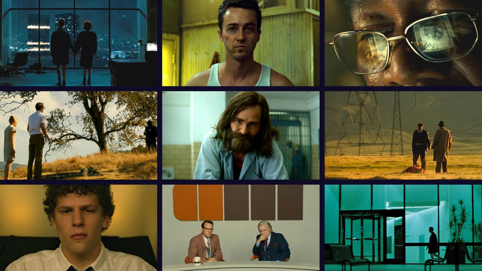
One could point to any number of impressive techniques used in David Fincher movies, but perhaps one of the most important is his movie color palette. As he himself once said, “In film, we sculpt time, we sculpt behavior and we sculpt light.” That last one is what we’re focusing on today. Here are some of the more powerful ways Fincher’s color palette enhances his stories and characters.
David Fincher Directing
How David Fincher directs a movie
More than most directors, David Fincher has spent his career taking the components of everyday existence and dissecting them to the point of obsession. After all, it’s not uncommon for him to shoot 40 plus takes of a scene. This, as he has mentioned before, is not about driving the actors crazy. It's about “finding the moments between the moments that resonate.”
Here's Fincher, in his own words, about his approach to the craft of directing.
David Fincher Director's Chair • Subscribe on YouTube
David Fincher movies want to get at the heart of what makes reality tick. How human and environmental forces compliment and antagonize one another. Fincher's directing style shows his dedication to precision and a dark, somber aesthetic. In this video, we break down the seven major elements in his style, including more on his use of color.
David Fincher Directing Style • Subscribe on YouTube
Let's now turn our attention to the color in David Fincher's work. Here's a quick rundown of his most common color schemes and how they play into his aesthetic as well as help tell the story.
David Fincher Color Palette • Subscribe on YouTube
In many ways, the David Fincher style is one of exploration. He digs below the surface of mind and matter to gain an unfamiliar, but no less true representation of our reality.
As the Fight Club director says, “Call me a radical, but people go to the movies to see things they haven’t seen before.” Perhaps more than anything that’s what Fincher’s directing style and movie color palette provides. It gives the audience something they haven’t seen before.
Complementary Colors
Complementary movie color palettes
Conflict is at the heart of any story, but in David Fincher films the idea of conflict is something more complex and unexpected.
Of course, Fincher has never shied away from conflict. After all, just look at the titles of his films: The Game, Fight Club, Panic Room.
But instead of merely focusing on the internal and external forces affecting the characters, Fincher makes it a point to utilize the environment’s color palette in expressing conflict as well. That's why his use of complementary color schemes helps to subconsciously echo this conflict.
For Fincher, everything in the shot is an extension of the characters and should reflect their dilemmas. It’s not only the objects themselves that should tell a story but the colors and textures comprising them.
Take the final moments of Fight Club for example.
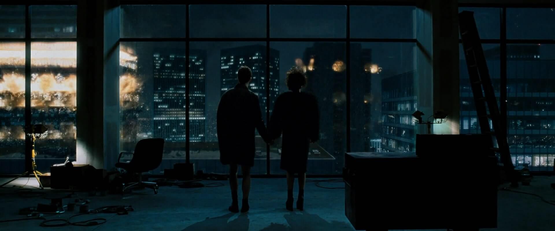
Film color palettes in David Fincher movies help reveal emotions
As Jack and Marla stand side-by-side bathed in bluish light, the sudden explosions of orange illustrate not only the danger of the moment but the uncertainty of their shared future.
Film color palette choices like these represent conflict existing both in the minds of characters and the locations containing them.
MONOCHROMATIC COLORS
Monochromatic movie color palettes
Fincher says, “You have a responsibility for the way you make an audience feel, and I want them to feel uncomfortable.”
Setting is key in David Fincher films. It’s used not only to anchor the action but to provide the audience a better idea of the past and present of the characters.
Fincher wants the audience to feel the same way the characters do. This is achieved not only through the performances but through a movie color palette that will heighten the emotional weight of the scenes.
This is where Fincher's color palettes really shine — using monochromatic color schemes.
Take the opening from The Social Network for instance.
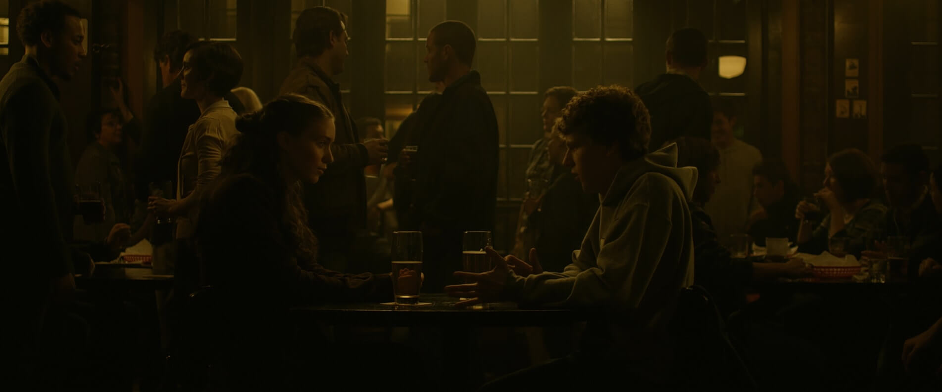
Monochromatic colors provide strong visual cohesion. The potential range of contrasting tones allows a viewer to better focus on the action in front of them.
When Zuckerberg says, “I don’t want friends,” the dark tones of the cramped bar amplify his feelings of insecurity and isolation.
We can’t help but feel the anger and confusion between these individuals. It’s the monochromatic color palette that conveys the views of these troubled characters.
POPS OF COLOR
Discordant movie color palettes
Just as Fincher embraces the clashing of his characters, the same holds true for his movie color palettes.
Discordant colors are those almost opposite one another on the color wheel.
Although they may not be as soothing as complementary colors, they do evoke an energy that makes them ideal for enhancing suspense; a signature of the David Fincher filmography.
Who hasn’t cringed when Detective David Mills says, “What’s in the box?”
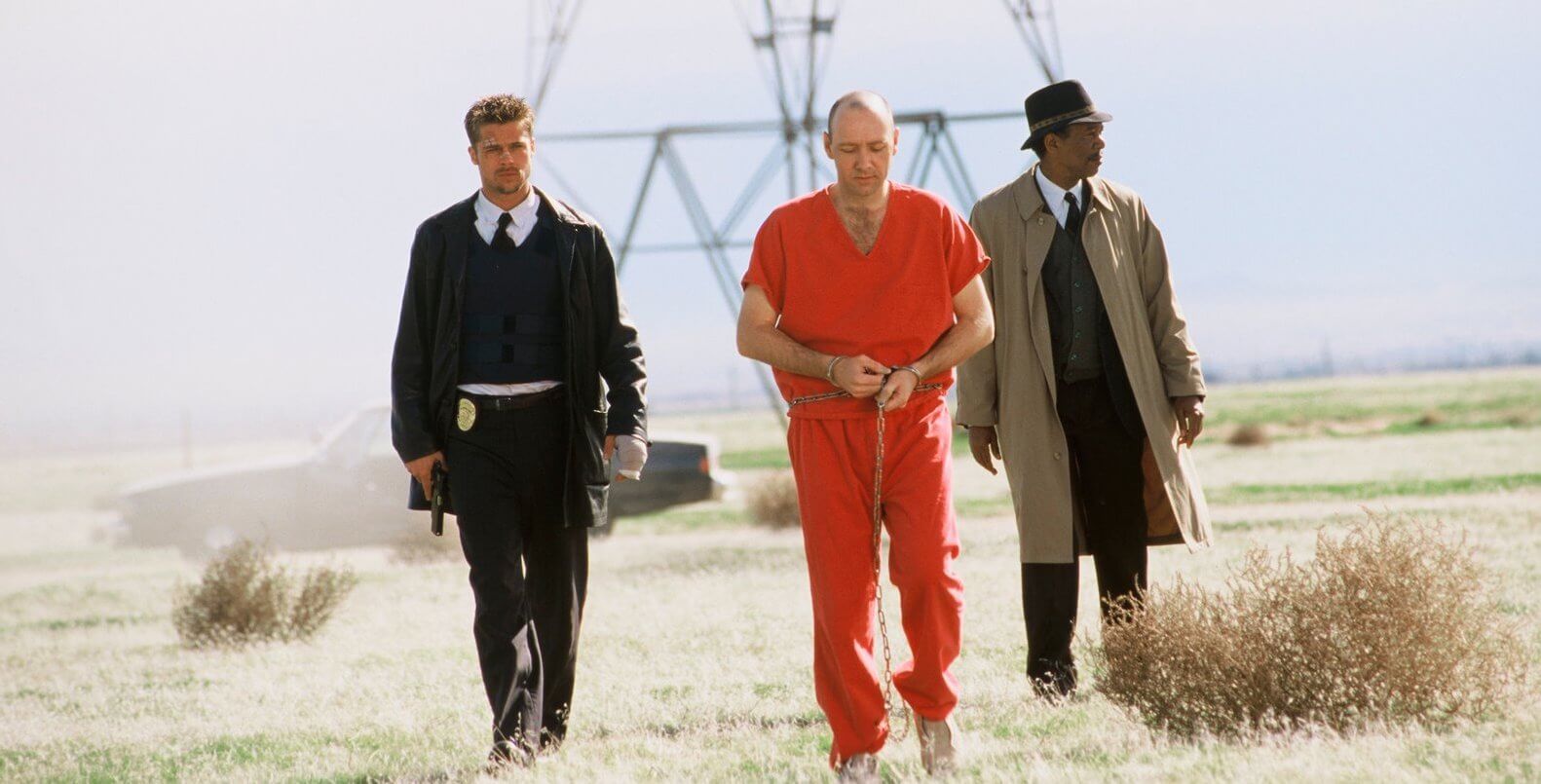
A clashing movie color palette helps draw attention to the action
Here, the orange of John Doe’s uniform and the dark tones of the detectives’ jackets add to the jarring and unnerving nature of the scene.
Doe, like a virus, feeds off the frustrations of these individuals. The vibrancy of his outfit makes him all the more menacing.
With a discordant film color palette, Fincher draws our attention to out of place elements in order to keep anticipation at its most heart-pounding intensity.
For a deep dive into color theory, color schemes, and how they work in visual storytelling, download our FREE ebook: How to Use Color in Film.
Free downloadable bonus
FREE Download
How to Use Color in Film
Hue, saturation, brightness — the three elements of color that make all the difference. In this book, we'll explain the aesthetic qualities and psychology effects of using color in your images. Topics include color schemes like analogous and triadic colors and how color palettes can tell stories of their own.
Up Next
Movie color palettes
Up next, we're going to look at using color in film by looking at the various color schemes driven by the fascinating thoughts behind color theory. We'll look at examples from all genres and how some of the greatest filmmakers use color as just another tool to tell their story.
Up Next: Color Palette Examples →
Showcase your vision with elegant shot lists and storyboards.
Create robust and customizable shot lists. Upload images to make storyboards and slideshows.
